File:Fig2a Easton OJofPubHlthInfo2015 7-3.jpg
Original file (770 × 740 pixels, file size: 220 KB, MIME type: image/jpeg)
Summary
| Description |
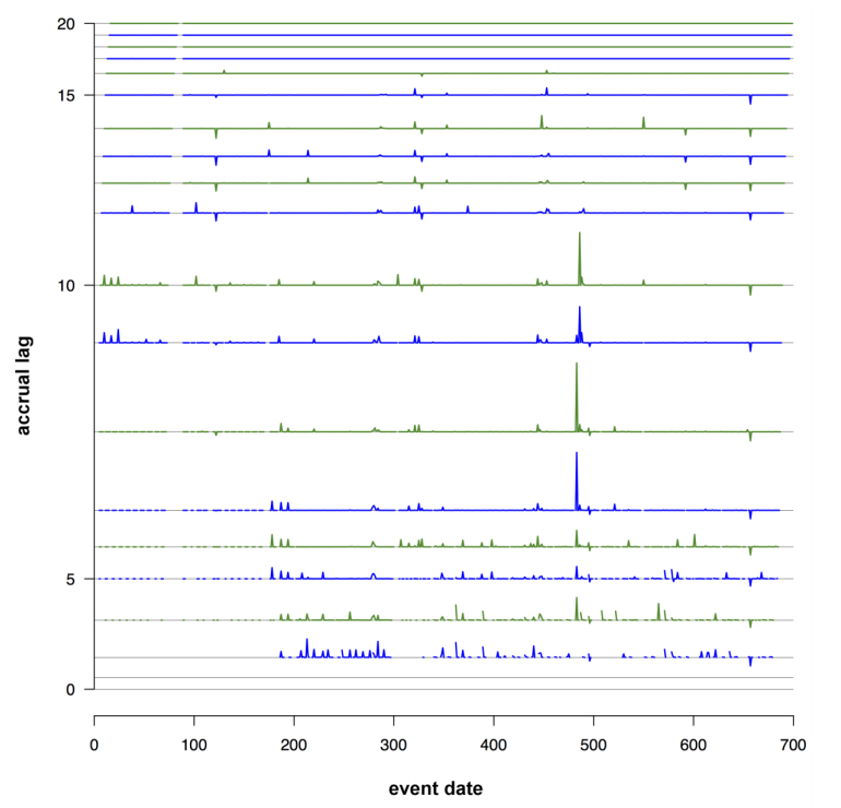
Figure 2a. Stacklag Difference Plot. The horizontal axis represents the event date and each vertical number on the vertical axis represents accrual lag in days. The time series plotted for each accrual lag represents the change in the total number of counts from the previous accrual lag. |
|---|---|
| Source |
Eaton, J.; Painter, I.; Olson, D.; Lober, W. (2015). "Visualizing the quality of partially accruing data for use in decision making". Online Journal of Public Health Informatics 7 (3): e226. doi:10.5210/ojphi.v7i3.6096. |
| Date |
2015 |
| Author |
Eaton, J.; Painter, I.; Olson, D.; Lober, W. |
| Permission (Reusing this file) |
|
| Other versions |
Licensing
|
|
This work is licensed under the Creative Commons Attribution-NonCommercial 3.0 Unported License. |
File history
Click on a date/time to view the file as it appeared at that time.
| Date/Time | Thumbnail | Dimensions | User | Comment | |
|---|---|---|---|---|---|
| current | 22:06, 16 May 2016 | | 770 × 740 (220 KB) | Shawndouglas (talk | contribs) |
You cannot overwrite this file.
File usage
The following page uses this file:


