File:Fig1 Maury FrontDigHlth2021 3.jpg
Original file (971 × 1,339 pixels, file size: 555 KB, MIME type: image/jpeg)
Summary
| Description |
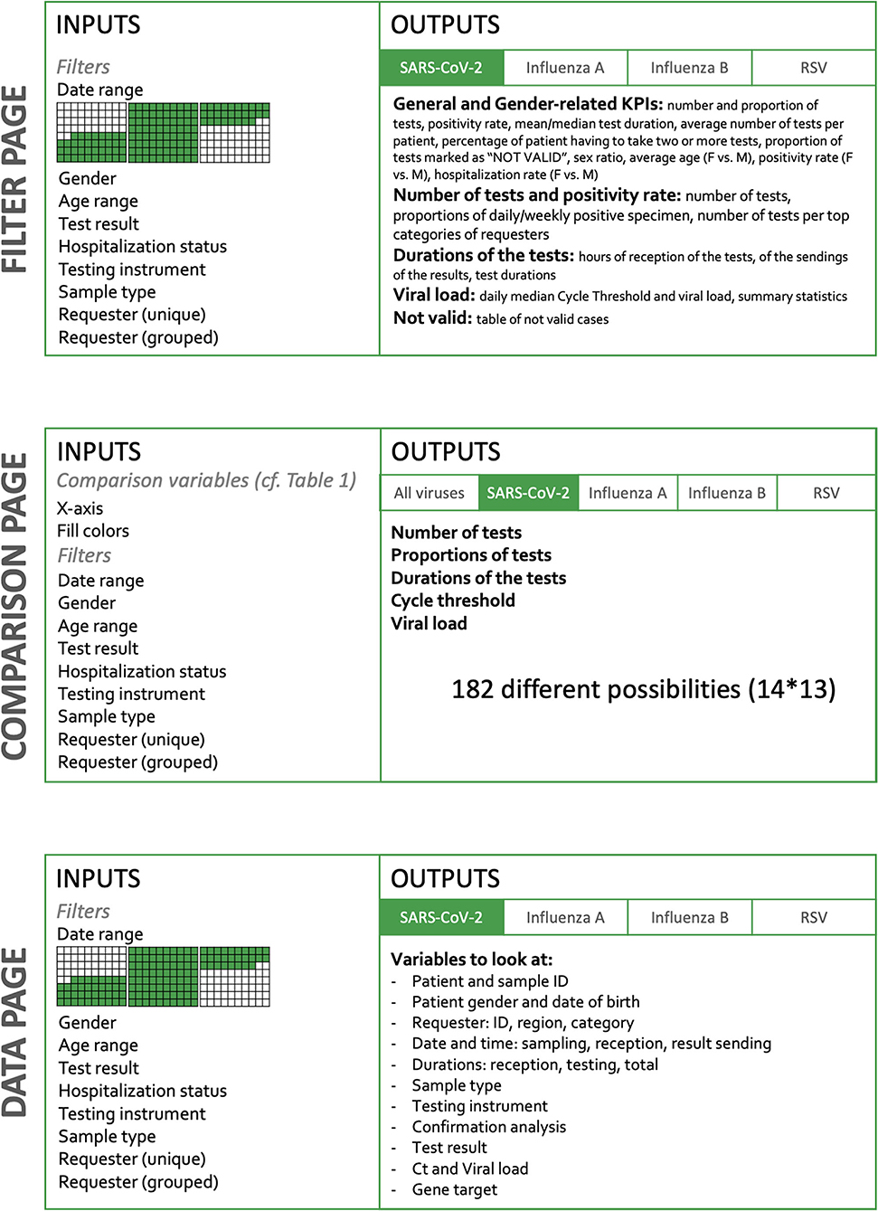
Figure 1. Dashboard structure. The dashboard is organized in three main parts: a Filter page, Comparison page, and Data page. On the filtering page, key indicators are available such as the number of specimens, time to results, positivity rate, percent of invalid tests, etc. These indicators are provided by default for the whole dataset, but are also available for subgroups, according to the filtering criteria applied to the whole dataset. Thus, it is possible in a click to observe specifically the tests done during a given period or done on a dedicated instrument. It is also possible to select only the analysis performed for a given requester. The Comparison page offers more than 182 combinations of the KPI. The Data page gives access to the raw data in a table format that can be downloaded; filters can be applied to choose a subset of data of interest. |
|---|---|
| Source |
Maury, E.; Boldi, M.-O.; Greub, G.; Chavez, V.; Jaton, K.; Opota, O. (2021). "An automated dashboard to improve laboratory COVID-19 diagnostics management". Frontiers in Digital Health 3: 773986. doi:10.3389/fdgth.2021.773986. |
| Date |
2021 |
| Author |
Maury, E.; Boldi, M.-O.; Greub, G.; Chavez, V.; Jaton, K.; Opota, O. |
| Permission (Reusing this file) |
|
| Other versions |
Licensing
|
|
This work is licensed under the Creative Commons Attribution 4.0 License. |
File history
Click on a date/time to view the file as it appeared at that time.
| Date/Time | Thumbnail | Dimensions | User | Comment | |
|---|---|---|---|---|---|
| current | 19:09, 17 February 2022 | | 971 × 1,339 (555 KB) | Shawndouglas (talk | contribs) |
You cannot overwrite this file.
File usage
The following page uses this file:


