File:Fig3 Cassim AfricanJLabMed2020 9-2.jpg
Original file (1,418 × 952 pixels, file size: 786 KB, MIME type: image/jpeg)
Summary
| Description |
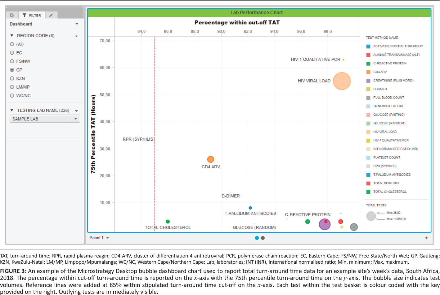
Figure 3. An example of the Microstrategy Desktop bubble dashboard chart used to report total turn-around time data for an example site’s week’s data, South Africa, 2018. The percentage within cutoff turnaround time is reported on the x-axis with the 75th percentile turnaround time on the y-axis. The bubble size indicates test volumes. Reference lines were added at 85% within stipulated turnaround time cutoff on the x-axis. Each test within the test basket is colour coded with the key provided on the right. Outlying tests are immediately visible. |
|---|---|
| Source |
Cassim, N.; Tepper, M.E.; Coetzee, L.M.; Glencross, D.K. (2020). "Timely delivery of laboratory efficiency information, Part I: Developing an interactive turnaround time dashboard at a high-volume laboratory". African Journal of Laboratory Medicine 9 (2): a947. doi:10.4102/ajlm.v9i2.947. |
| Date |
2020 |
| Author |
Cassim, N.; Tepper, M.E.; Coetzee, L.M.; Glencross, D.K. |
| Permission (Reusing this file) |
|
| Other versions |
Licensing
|
|
This work is licensed under the Creative Commons Attribution 4.0 License. |
File history
Click on a date/time to view the file as it appeared at that time.
| Date/Time | Thumbnail | Dimensions | User | Comment | |
|---|---|---|---|---|---|
| current | 22:12, 18 January 2021 | | 1,418 × 952 (786 KB) | Shawndouglas (talk | contribs) |
You cannot overwrite this file.
File usage
The following page uses this file:


