Difference between revisions of "File:Fig3 Naulaerts BioAndBioInsights2016 10.png"
Shawndouglas (talk | contribs) |
Shawndouglas (talk | contribs) (Added summary.) |
||
| Line 1: | Line 1: | ||
==Summary== | |||
{{Information | |||
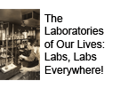
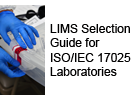
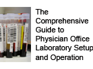
|Description='''Figure 3.''' Visual representation of pattern clustering. Each pie chart starts from a single item in the center and expands outward with those items that were found in associated patterns. The size of each piece in the pie chart indicates the support value of this pattern and its ancestor, giving a relative image of how frequent the items are compared with the others. For the singletons, this equals their individual frequency (upper circular plot, first layer). Only patterns with a length of two items are shown for legibility reasons in the figure, but this can be extended to virtually any itemset size. Detail plots of the size-2 itemsets are also shown (right, bottom left, bottom right) and indicate if a given item appears (dark blue node central in plot), how likely it will be associated with any of the other terms. The purple pie chart contains kinase-related patterns, green consists of GTPases and Helicases, and red is associated with WD40 repeats. | |||
|Source={{cite journal |title=Practical approaches for mining frequent patterns in molecular datasets |journal=Bioinformatics and Biology Insights |author=Naulaerts, S.; Moens, S.; Engelen, K.; Vanden Berghe, W.; Goethals, B.; Laukens, K.; Meysman, P. |volume=10 |pages=37–47 |year=2016 |doi=10.4137/BBI.S38419 |pmid=27168722 |pmc=PMC4856181}} | |||
|Author=Naulaerts, S.; Moens, S.; Engelen, K.; Vanden Berghe, W.; Goethals, B.; Laukens, K.; Meysman, P. | |||
|Date=2016 | |||
|Permission=[https://creativecommons.org/licenses/by/3.0/ Creative Commons Attribution 3.0 Unported] | |||
}} | |||
== Licensing == | == Licensing == | ||
{{cc-by-3.0}} | {{cc-by-3.0}} | ||
Latest revision as of 15:46, 24 August 2016
Summary
| Description |
Figure 3. Visual representation of pattern clustering. Each pie chart starts from a single item in the center and expands outward with those items that were found in associated patterns. The size of each piece in the pie chart indicates the support value of this pattern and its ancestor, giving a relative image of how frequent the items are compared with the others. For the singletons, this equals their individual frequency (upper circular plot, first layer). Only patterns with a length of two items are shown for legibility reasons in the figure, but this can be extended to virtually any itemset size. Detail plots of the size-2 itemsets are also shown (right, bottom left, bottom right) and indicate if a given item appears (dark blue node central in plot), how likely it will be associated with any of the other terms. The purple pie chart contains kinase-related patterns, green consists of GTPases and Helicases, and red is associated with WD40 repeats. |
|---|---|
| Source |
Naulaerts, S.; Moens, S.; Engelen, K.; Vanden Berghe, W.; Goethals, B.; Laukens, K.; Meysman, P. (2016). "Practical approaches for mining frequent patterns in molecular datasets". Bioinformatics and Biology Insights 10: 37–47. doi:10.4137/BBI.S38419. PMC PMC4856181. PMID 27168722. https://www.ncbi.nlm.nih.gov/pmc/articles/PMC4856181. |
| Date |
2016 |
| Author |
Naulaerts, S.; Moens, S.; Engelen, K.; Vanden Berghe, W.; Goethals, B.; Laukens, K.; Meysman, P. |
| Permission (Reusing this file) |
|
| Other versions |
Licensing
|
|
This work is licensed under the Creative Commons Attribution 3.0 Unported License. |
File history
Click on a date/time to view the file as it appeared at that time.
| Date/Time | Thumbnail | Dimensions | User | Comment | |
|---|---|---|---|---|---|
| current | 15:45, 24 August 2016 | 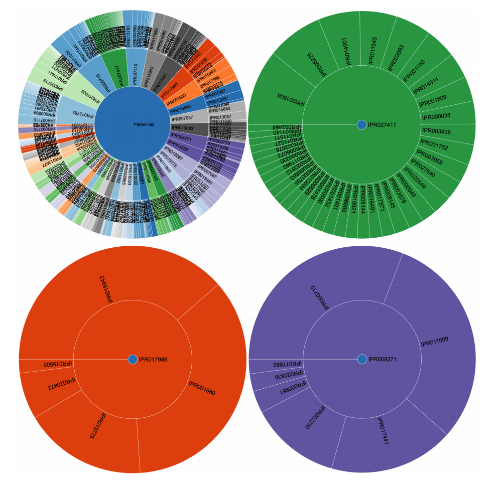 | 996 × 963 (553 KB) | Shawndouglas (talk | contribs) |
You cannot overwrite this file.
File usage
The following page uses this file:


