Journal:Bridging data management platforms and visualization tools to enable ad-hoc and smart analytics in life sciences
| Full article title | Bridging data management platforms and visualization tools to enable ad-hoc and smart analytics in life sciences |
|---|---|
| Journal | Journal of Integrative Bioinformatics |
| Author(s) | Panse, Christian; Trachsel, Christian; Türker, Can |
| Author affiliation(s) | Functional Genomics Center Zurich |
| Primary contact | Email: cp at fgcz dot ethz dot ch |
| Year published | 2022 |
| Volume and issue | 19(4) |
| Article # | 20220031 |
| DOI | 10.1515/jib-2022-0031 |
| ISSN | 1613-4516 |
| Distribution license | Creative Commons Attribution 4.0 International |
| Website | https://www.degruyter.com/document/doi/10.1515/jib-2022-0031/html |
| Download | https://www.degruyter.com/document/doi/10.1515/jib-2022-0031/pdf (PDF) |
|
|
This article should be considered a work in progress and incomplete. Consider this article incomplete until this notice is removed. |
Abstract
Core facilities, which share centralized research resources across institutions and organizations, have to offer technologies that best serve the needs of their users and provide them a competitive advantage in research. They have to set up and maintain tens to hundreds of instruments, which produce large amounts of data and serve thousands of active projects and customers. Particular emphasis has to be given to the reproducibility of the results. Increasingly, the entire process—from building the research hypothesis, conducting the experiments, and taking the measurements, through to data exploration and analysis—is solely driven by very few experts in various scientific fields. Still, the ability to perform data exploration entirely in real-time on a personal computer is often hampered by the heterogeneity of software, data structure formats of the output, and the enormous data file sizes. These impact the design and architecture of the implemented software stack.
At the Functional Genomics Center Zurich (FGCZ), a joint state-of-the-art research and training facility of ETH Zurich and the University of Zurich, we have developed the B-Fabric system, which has served for more than a decade an entire life sciences community with fundamental data science support. In this paper, we describe how such a system can be used to glue together data (including metadata), computing infrastructures (clusters and clouds), and visualization software to support instant data exploration and visual analysis. We illustrate our implemented daily approach using visualization applications of mass spectrometry (MS) data.
Keywords: accessible, findable, interoperable, and reusable (FAIR); integrations for data analysis; open research data (ORD); workflow
Introduction
Core facilities—which act as a discrete, centralized location for shared research resources for institutions or organizations[1]—aim to support scientific research where terabytes of archivable raw data are routinely produced every year. This data is annotated, pre-processed [1], quality-controlled [2], and analyzed, ideally within research pipelines. Additionally, reports are generated and charges are sent to the customers to conclude the entire support process. Typically, data acquisition, management, and analysis cycles are conducted in parallel for multiple projects with different research questions, involving several experts and scientists from different fields, such as biology, medicine, chemistry, statistics, and computer science, as well as various fields of omics.
Figure 1 sketches a typical omics workflow: (a) Samples of different organisms and tissues (e.g., a fresh frozen human tissue sample with indicated cancer and benign prostate tissue areas, or an Arabidopsis or Drosophila melanogaster [3] model organism) are collected. (b) Sequencing and mass spectrometry (MS) are typical methods of choice to perform measurement based on the prepared samples in the omics fields. (c) Data handling and archiving occurs, including metadata, with special emphasis on the reproducibility of the measurement results. (d) Largely known community-developed bioinformatics tools and visualization techniques are applied ad-hoc to gain knowledge, exploiting not only the raw data but also the associated metadata.
|
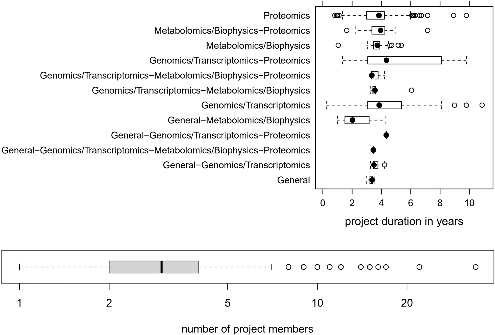
It is important to note that most omics projects run over several years. Figure 2 depicts the typical duration of omics projects and the involved number of project members, as we have witnessed in our core facility over almost two decades.
|
The interdisciplinary nature of such scientific projects requires a powerful and flexible platform for data annotation, communication, and exploration. Information visualization techniques [4, 5], especially interactive ones, are well suited to support the exploration phase of the conducted research. However, general support for a wide area of applications is often hampered for different reasons:
- Heterogeneity of structure and missing implementation of standards may disable the easy bundling of existing applications.
- Prototype applications may not be deployable and maintainable in a more extensive system setup, as they may be needed for production use.
- Initial costs per user may be high. [6]
- Scientists usually have limited programming skills.
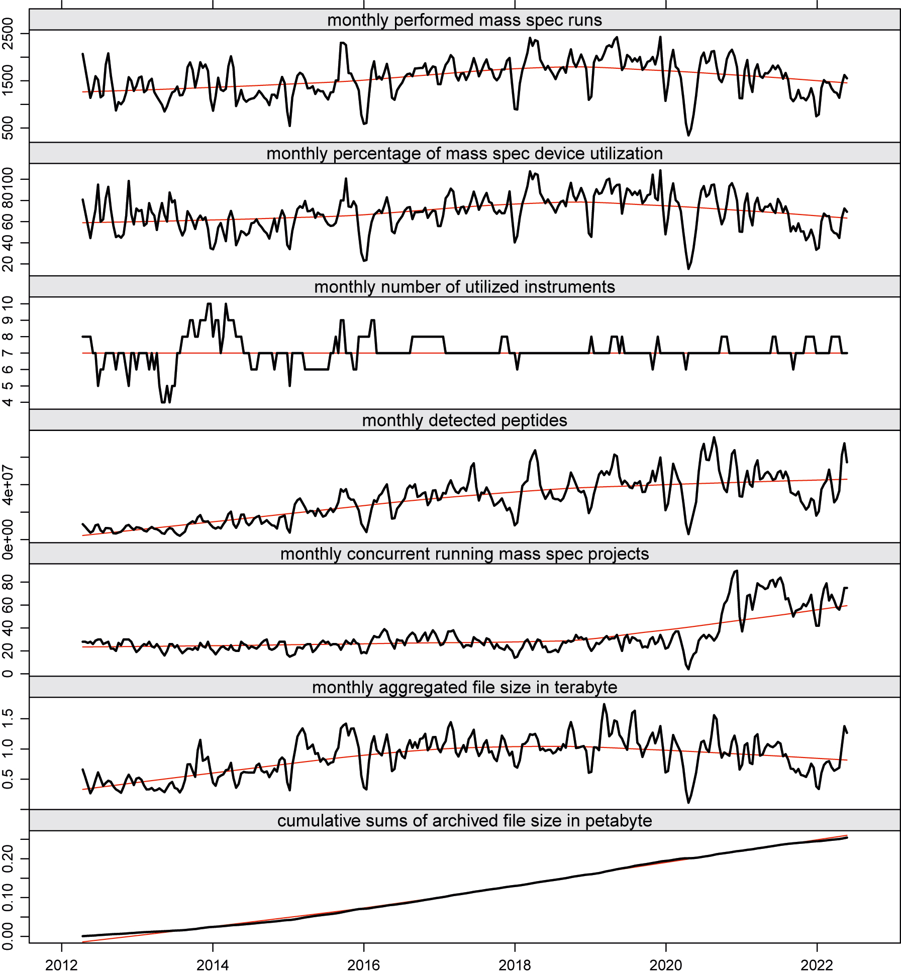
The graphs in Figure 3 depict some key performance indicator (KPI) trends while plotting a monthly sliding window over the aggregated data of conducted runs, the number of concurrent running research projects, and the number of detected peptides (proteins) of our MS unit at the Functional Genomics Center Zurich (FGCZ).
|
Throughout the years, we observed the phenomenon that traditional core IT development cannot cope with the pace of the evolution cycles of data analysis applications. [1, 7] Sometimes, new data analysis tools become obsolete before being fully integrated into the core IT system. Consequently, the core IT development team needs to carefully evaluate the latest trends in data analysis and assess which ones should be implemented first, considering not only scientific but also economic factors. At our core facility, we are faced with fundamental data processing and analysis problems due to challenging data formats used in the different scientific areas. In the following, we provide a brief example on a default proteomics workflow, as sketched in Figure 1, but note that the system analogously serves for other technology areas at our facility, such as sequencing, genomics, metabolomics, and single cell analysis.
Our use case
In MS, for example, the mass charge ratio of ions is determined and the data is recorded as a spectrum consisting of a mass–ion charge ratio (m/Z) axis (x coordinates) and an intensity axis (y coordinates). In proteomics— where “everything in life is driven by proteins” [8]—the ions of interest are generated from peptides separated by liquid chromatography (LC) in time (from 30 minutes up to several hours) and recorded with high scan speed (up to 40 Hz). These quickly result in datasets of thousands of scans, each containing several hundreds of ions. Additional complexity is added to the data by the fact that the spectra can be recorded on different MS levels. On MS level 1 (MS1), a simple survey is performed, while on MS level 2 (MS2), a specific ion from an MS1 scan is selected, isolated, fragmented, and the resulting fragment ions are recorded. On MS level 3 (MS3), an ion from an MS2 scan is selected for further fragmentation. To make matters more complicated, on MS2 and higher, different types of activation techniques can be selected for fragmentation. This setup allows for the generation of complex experiments, which in turn results in detailed nested data. To answer a scientific question with such MS data, it is necessary to filter out some selected ions of interest from several million of ions distributed over the data structure. Some typical questions in this area are:
- Which proteins can be identified in an organism under which conditions?
- Can particular post-translational modifications (PTMs), e.g., phosphorylation on STY, be detected or new ones discovered?
- How do protein abundance levels or PTM patterns change under different conditions?
Ideally, data is measured, automatically transferred to storage, and fed into a meta-database using automated robots in a large-scale high-throughput manner by using proprietary software provided by the vendors, or free software packages. The analysis part is often implemented by using environments such as the Comprehensive R Archive Network (CRAN) [9] and Bioconductor [10–12], and packages like shiny [13], allowing the integration of largely known bioinformatics tools [14–19] and visualization techniques. [4, 5, 10, 20, 21, 22] The packages knitr [23] and rmarkdown [24] facilitate automated and reproducible report generation. The art is found in bringing all these tools together to document the research steps such that the data involved can be provided and interpreted correctly. For that, an integrative platform is needed.
Contributions of this work
It is essential to note this paper focuses neither on presenting a new visualization tool nor on introducing a new integrative platform. The goal is to share experiences we made in quickly developing visualization applications in the area of life sciences based on an integrative platform on which we have successfully implemented and run for more than 10 years at our core facility. We will demonstrate how to couple and run real visualization applications on our generic integrative platform, called B-Fabric. As an example, we have chosen the visualization of MS data. Here, we will show how existing software (an R package, e.g., PTM MarkerFinder [25]) can be integrated into a shiny framework. The B-Fabric platform will only be sketched at a level needed to understand this paper’s message. We refer the reader to various works of Türker et al. [7, 26, 27] for more details on B-Fabric. In the remainder of this paper, we will show how to link applications to B-Fabric to detect a given set of mass patterns by applying the full bandwidth of information visualization techniques developed in the last 30 years and available through environments like R shiny. [13] While this particular application focuses on identifying PTM signatures [25, 28], the application itself could be exchanged easily with others. Also, traditional visualization systems, such as Spotfire [29], can be used on the higher layer of our architecture.
The paper organization is as follows. The next section provides a brief overview of the data management system, while two typical application examples—one interactive and one with a graphical user interface—are described after that. The final sections provide some lessons learned and conclusions made with the described solution.
Integrative system platform
Abbreviations, acronyms, and initialisms
ADP: adenosine diphosphate CRAN: Comprehensive R Archive Network LC: liquid chromatography LT: linear ion trap MS m/Z: mass–ion charge ratio MS: mass spectrometry MS/MS: tandem mass spectrometry PTM: post-translational modification QC: quality control STY: serine, threonine, and tyrosine TIC: total ion count
References
- ↑ "Definitions". Research Core Facilities at Drexel University. Drexel University. 2023. https://drexel.edu/core-facilities/resources/definitions/.
Notes
This presentation is faithful to the original, with only a few minor changes to presentation, grammar, and punctuation. In some cases important information was missing from the references, and that information was added. The authors don't define "core facility" in the original text; a definition and citation is provided for this version.

